During my Junior Year in high school (2012-2013) I was the editor of our school's annual yearbook. I was shocked that I was editor since I had never done graphic design before and it was my first year working on the yearbook. During the course I really enjoyed designing spreads and having the final say in what was going to stay and what was going to be kicked out of the book. But I think over all, I really enjoyed taking the pictures for each spread and choosing the layout that the pictures were going to lay in. Below are the spreads that I did by myself. Feel free to click on the pictures that are on the page, they will enlarge so you can see them easier.
Page One
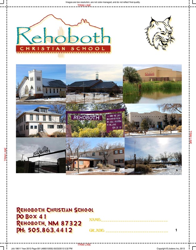
This single page spread is the first page that you see when you open the yearbook. I took those photos that you see on the page. They are scenes of our campus at school. This page was probably the easiest and took 45 minutes to do.
Pages six and seven
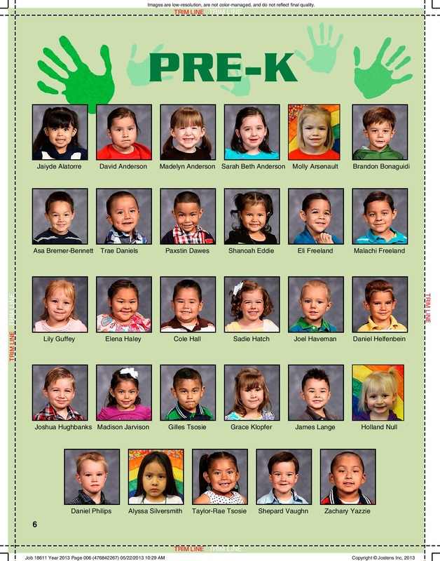
This was my very first two page spread that I worked on. I was excited about it and yet very nervous. This spread was defiantly the easiest spread that I worked on. All I had to do was chose a color for the background and have the hands and text match accordingly. Even though this was the simplest spread it took me the longest to do because I was unsure on how it was suppose to look or what I was suppose to do. Plus I was scared that I would match the names incorrectly with the picture above or spell a name wrong. This spread took about five months to do.
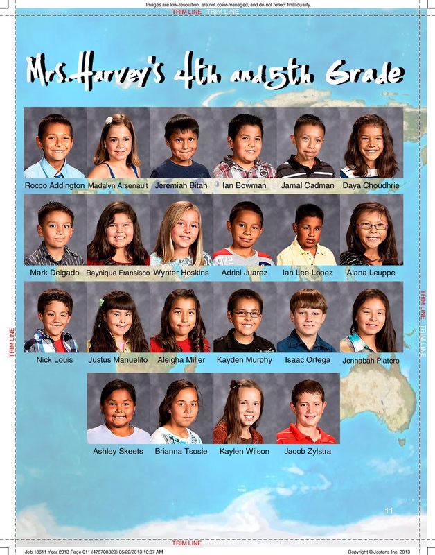
Pages ten and eleven
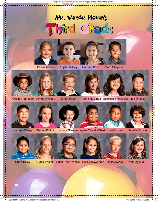
This two page spread seemed easier than the first but yet still challenging. I worked on the spreads with the fourth and fifth graders combined. I decided that they needed a background that would fit them and coincide with what they had learned this year. I thought that the world would be a good background because I remembered learning about the world at that age. I was also worried that I would match names up wrongly with pictures. But I think the most challenging part of this spread was tenting the background so it would not draw attention from the students on the page. This spread took three months to do.
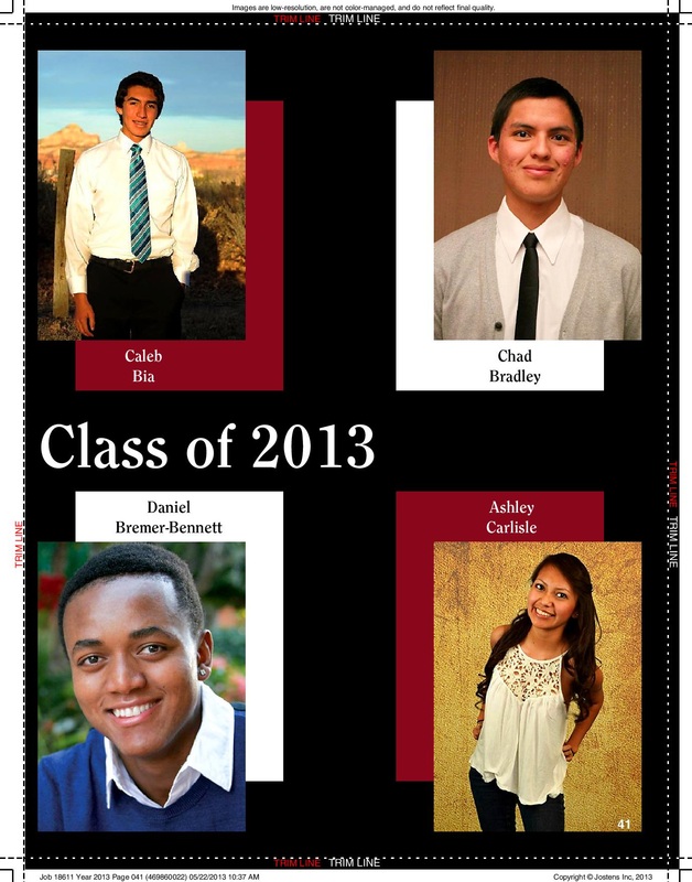
Pages forty through forty-nine
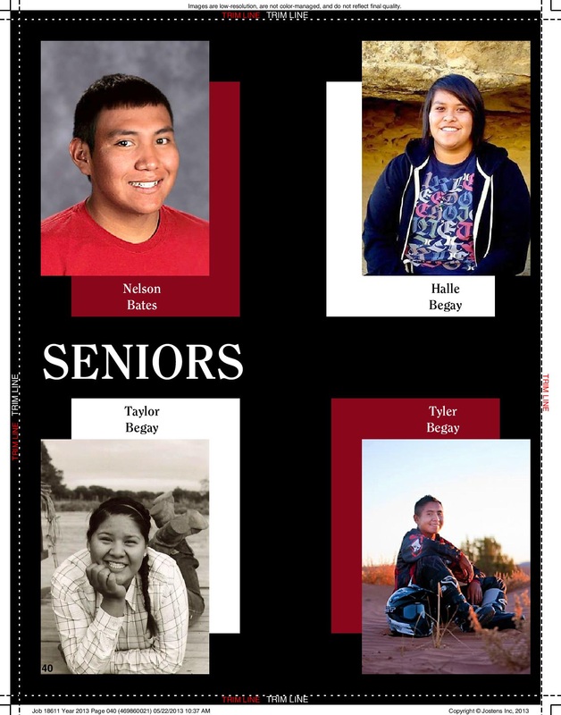
I was able to have the privilege to work on the Senior spreads. This is the first spread of the five that are dedicated to the seniors. These spreads were not very hard at all. I chose to have them have a black background because it looked professional. Since I worked on these spreads I did not have to worry about spelling names wrong or matching them up incorrectly since I knew them all. I chose the shadows of each picture to bring out certain colors within that picture. I chose the specific colors of maroon and white since they are our school colors and they showed up best on black. These spreads took about a day each to complete.
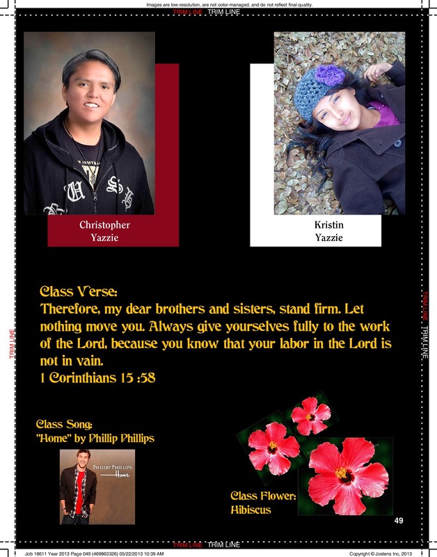
The last spread of the Seniors
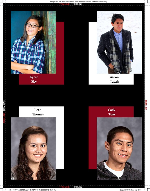
As mentioned before these spreads were not difficult at all. I chose to incorporate this specific spread because of the last page. On page forty-nine there were only two Seniors since all the rest had been accounted for already. I did not want to leave the rest of the page black, I wanted to fill it up. So I went to the school's website and looked up Senior information. I decided to include their class verse, 1 Corinthians 15:58, their class flower, hibiscus, and their class song, Home by Phillip Phillips. To fill the rest of the page and to make it more personalized for the seniors.
Pages sixty and sixty-one
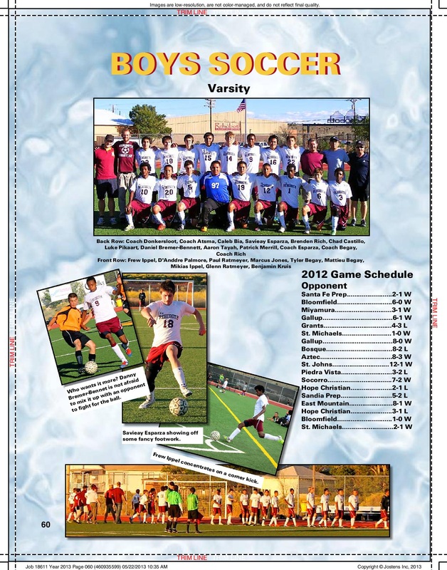
This was probably my favorite spread that I worked on throughout the whole book. I was the photographer, editor and I worked on the whole spread by myself with only others checking to make sure I did not spell things wrong. I enjoyed going out and watching the boys play and taking pictures of their finest moments. I am very proud of how this page turned out. This page took about a week to do. Mainly because I was not sure how I liked the layout and kept changing it.
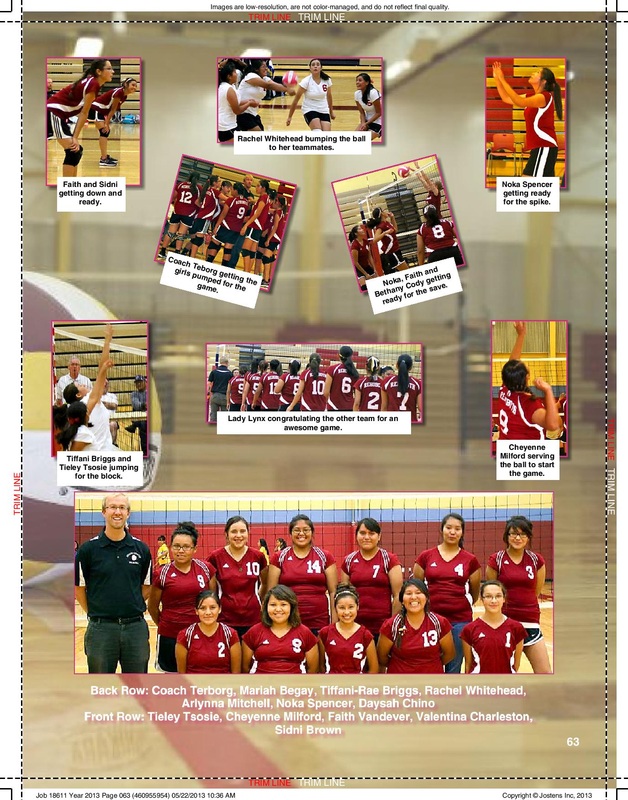
Pages sixty-two and sixty-three
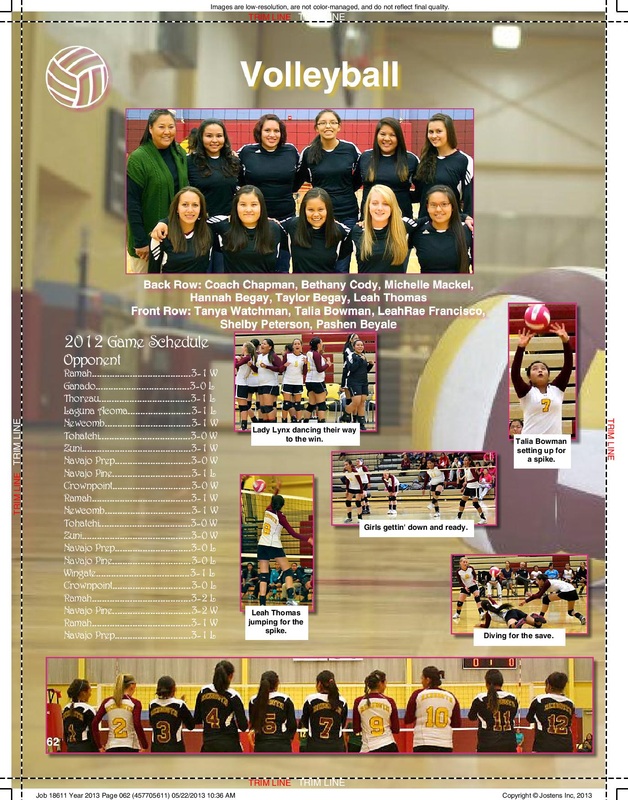
This spread I also did all by myself and had no help except having others check for spelling errors. But what sets this spread apart from the boys soccer is that I did not take the pictures for this spread. I took some however not all. What I am most proud of on this spread is the background. It was no in the backgrounds to choose from on Jostens, I went to the main gym where the volleyball games were held, grabbed a ball and laid on my stomach with the camera to take the picture. This spread took about three weeks to do.
Pages seventy-two and seventy-three
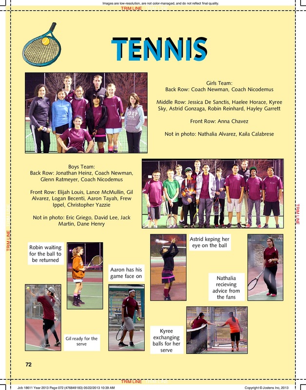
On this spread I only worked on the tennis side. This spread I also did all by myself. I found it very easy since I had already done both the girls volleyball and the boys soccer spreads. The only hard part on this page was the background. I did not want just a green or yellow background, but instead I wanted a background that mimicked the color of the tennis ball in the clip-art. This single page spread took me less than thirty minutes to complete.
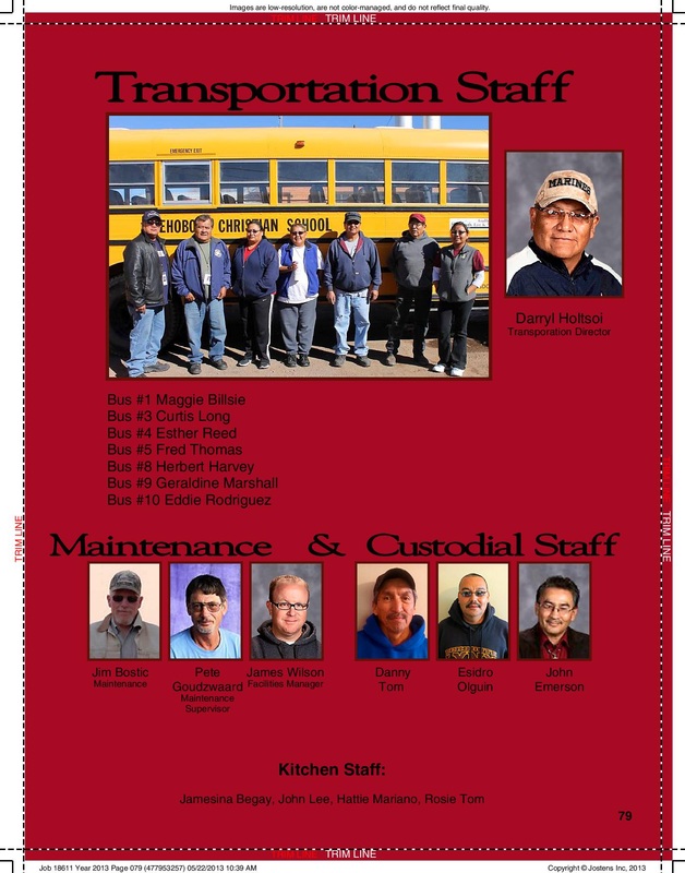
Pages seventy-eight and seventy-nine
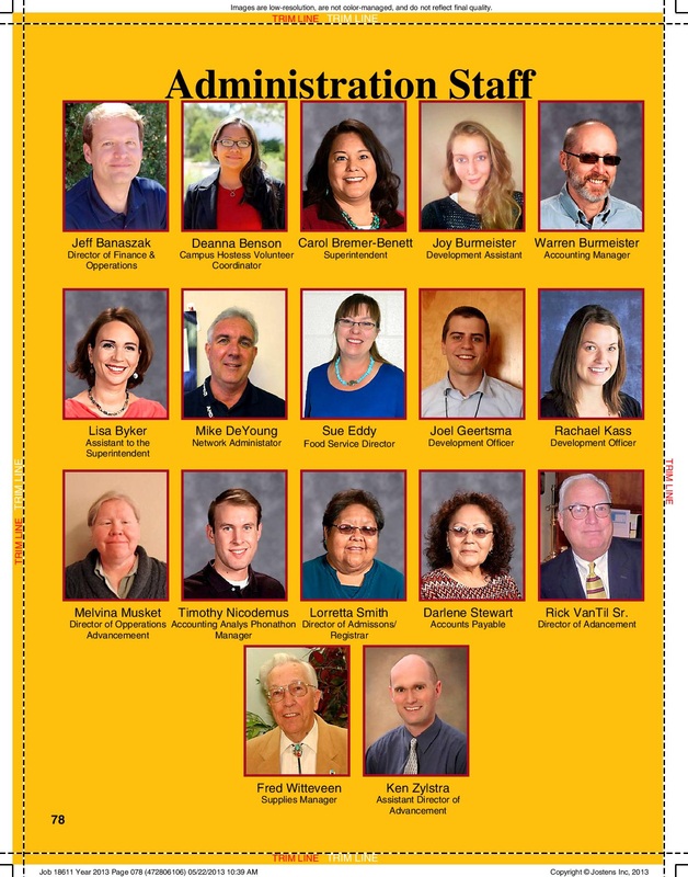
This two page spread was the very last spread I worked on in the yearbook, before editing. This spread was very simple and did not have much to it. The only problem I ran into while working on this spread alone was I would find out later that I missed someone and I would have to re-size everything to fit them on the page and put them in their spot in alphabetical order. I also ran into the same problem I did on my first spread. I did not know everyone so I was afraid that I would mess up or spell a name wrong. This spread took about two weeks to do.